Lucide vs Phosphor Icons
Quick verdict
Lucide and Phosphor Icons are both excellent icon tools, and the right pick depends on what you need. Lucide is beautiful & consistent open-source icons, a Feather community fork, while Phosphor Icons is a flexible icon family with 9000+ icons across six weights. For most people, Phosphor Icons is the safer default thanks to its wider adoption — but Lucide can be the better fit for the right workflow.
If you're choosing between Lucide and Phosphor Icons, you're not alone — they're two of the most talked-about icon tools around, and the differences aren't always obvious from their landing pages.
We track hundreds of icon tools on DesignBookmark, so we've put them side by side below: what each one is, where they overlap, how they differ, and a clear answer to which you should choose.
No fluff and no fabricated benchmarks — just an honest, practical comparison to help you decide fast.
At a glance
| Lucide | Phosphor Icons | |
|---|---|---|
| Type | Icons | Icons |
| Pricing | Free | Free |
| On DesignBookmark | Listed | Featured pick |
| Categories | 1 | 1 |
Pricing is a general guide and changes often — always confirm current plans on each tool's site.
What they have in common
At a high level, Lucide and Phosphor Icons are after the same thing. Both sit in our icons category, both are aimed at designers, developers and creators, and both are built to make that job faster and more enjoyable.
So if you're only going to use one, you won't be missing out on the fundamentals either way — the question is which one's particular take on icon tool suits you best. That's what the rest of this comparison digs into.
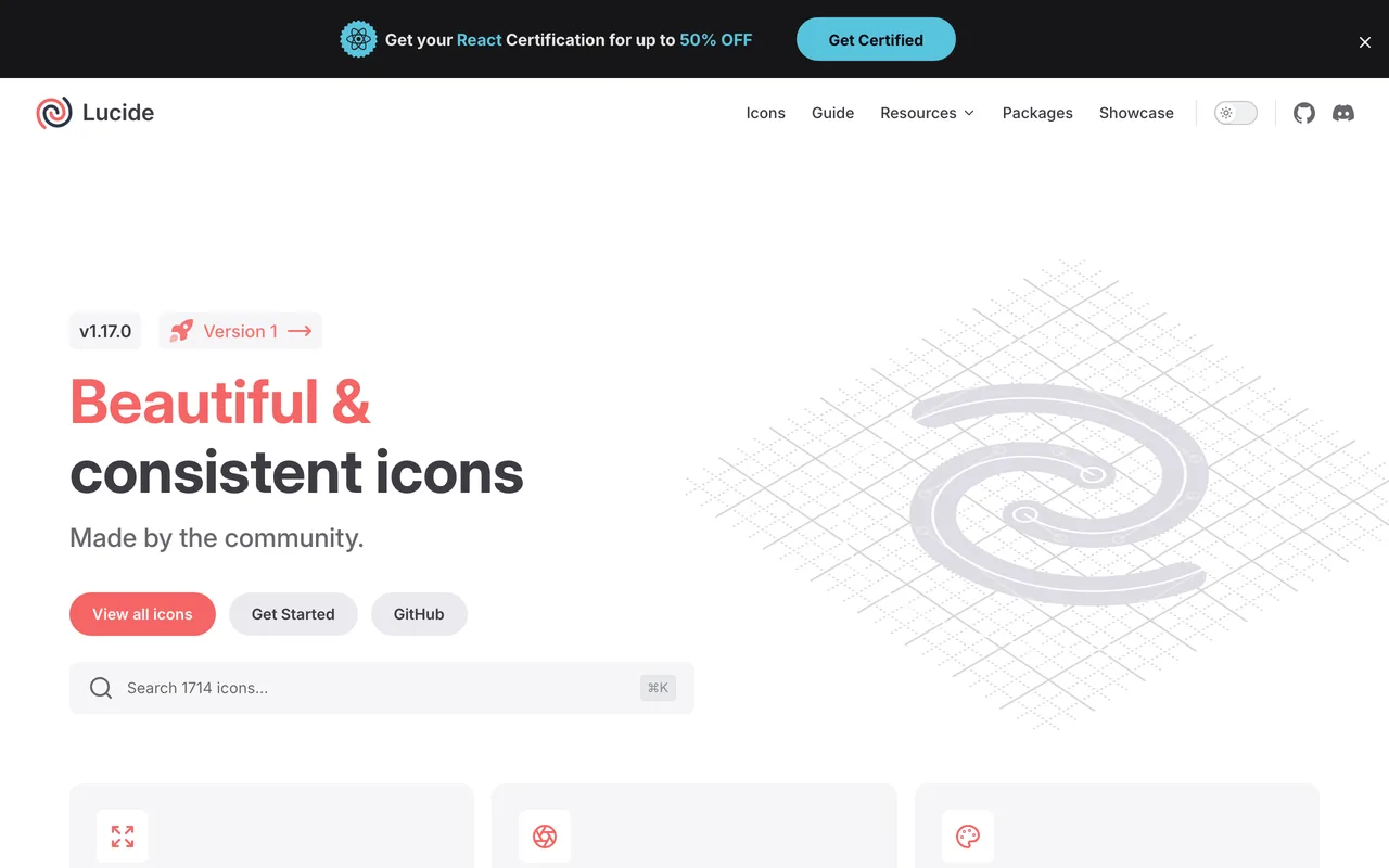
 Lucide
At its core, Lucide is beautiful & consistent open-source icons, a Feather community fork. What stands out is how focused and dependable it feels: it does what it promises, release after release.
Compared with Phosphor Icons, it's the one to reach for when you want something that just works out of the box. On the pricing side, Lucide is generally free — always click through to confirm current plans, since they change often.
 Phosphor Icons
Phosphor Icons is a flexible icon family with 9000+ icons across six weights. Its biggest strength is the everyday experience — the small details are thought through, so it gets out of your way and lets you work.
Against Lucide, it tends to win people over when a clean, familiar workflow is the priority. On the pricing side, Phosphor Icons is generally free — always click through to confirm current plans, since they change often.
How to choose between Lucide and Phosphor Icons
Pick Lucide
Choose Lucide if beautiful & consistent open-source icons, a Feather community fork sounds like exactly what you need.
Pick Phosphor Icons
Choose Phosphor Icons if you want the more established, widely-adopted pick that most people reach for first.
Pricing & how you'll pay
Lucide and Phosphor Icons use broadly similar pricing models, so cost is unlikely to be the deciding factor. Focus instead on which one fits your workflow — and always confirm the latest plans on each site, since pricing changes often.
Workflow & learning curve
The best icon tool is the one that disappears into your routine. Think about which interface feels more natural to you, which integrates with the apps you already use, and which you'd actually open every day. A short free trial of each tells you more than any feature chart.
Scope — all-rounder or specialist
Both cover similar ground here, so neither is obviously the "bigger" tool. Judge them on how well they do the specific job you care about most, rather than the length of their feature lists.
Momentum & community
A tool is only as good as the team and community behind it. Both Lucide and Phosphor Icons are actively maintained and listed on DesignBookmark for that reason — but it's worth a quick look at each one's changelog and community to see which is moving in a direction you like.
Frequently asked questions
Is Lucide better than Phosphor Icons?+
Neither is universally "better" — they're both strong icon tools, which is why people compare them. Lucide suits you if you want beautiful & consistent open-source icons, a Feather community fork; Phosphor Icons suits you if you want a flexible icon family with 9000+ icons across six weights. The best way to decide is to try both on a real project.
What's the difference between Lucide and Phosphor Icons?+
They overlap a lot — both are icon tools aimed at the same audience. The practical difference is emphasis: Lucide is beautiful & consistent open-source icons, a Feather community fork, whereas Phosphor Icons is a flexible icon family with 9000+ icons across six weights. That shapes which workflows each one feels best for.
Is Lucide or Phosphor Icons cheaper?+
Their pricing models are broadly similar (Lucide is free, Phosphor Icons is free), so cost isn't the deciding factor for most people. Check each site for the current plans, since they change regularly.
Can I use Lucide and Phosphor Icons together?+
Often, yes. Plenty of people use more than one icon tool side by side — one as their main driver and another for the things it does best. There's no rule that says you must pick only one, though most settle on a primary tool over time.
Is there a free version of Lucide or Phosphor Icons?+
Both generally offer a free or freemium way in, so you can try Lucide and Phosphor Icons before paying for either.
The bottom line
The bottom line: Phosphor Icons is the easier one to recommend as a default, but there's no wrong answer between Lucide and Phosphor Icons — they're both genuinely good icon tools. Re-read the "how to choose" points above, take whichever one speaks to you for a quick spin, and keep the one that earns a permanent place in your workflow.