shadcn/ui screenshotVisit website

shadcn/ui

Frameworks & Libraries

Freemium

About

Build your own component library from code you own.

shadcn/ui is a set of composable, accessible components with thoughtful defaults. Instead of installing a package, you copy the code into your project, then customize, extend and make it your own, which makes it a foundation for your design system.

Features & use cases

  • Copy components into your project
  • Customize and extend the code
  • Start from accessible, composable components
  • Build your own component library

Who reaches for it

  • React teams starting a design system from accessible defaults
  • Developers who want to own their component code instead of a package

Getting it

shadcn/ui publishes documentation.

Ready to try shadcn/ui?

Opens ui.shadcn.com in a new tab.

Visit website

Similar tools

The weekly drop

The best new tools, every week. No spam, unsubscribe anytime.
Alternatives & related tools

Tailark preview

Tailark

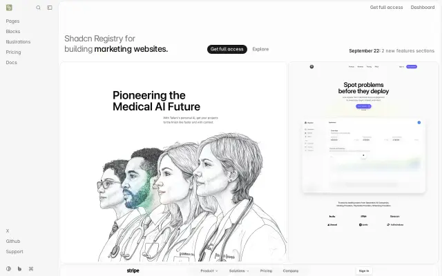
Modern, responsive, pre-built blocks for marketing websites.

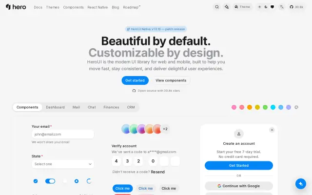
HeroUI preview

HeroUI

Beautiful, fast and modern React UI library, formerly NextUI.

Tremor preview

Tremor

React components to build charts and dashboards fast.

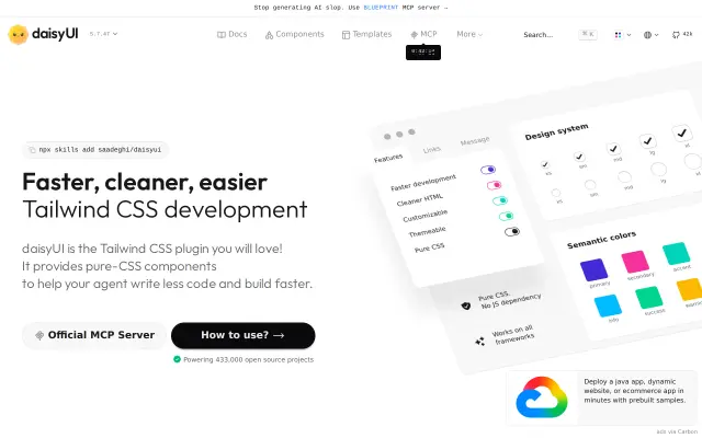
daisyUI preview

daisyUI

The most popular component library for Tailwind CSS.

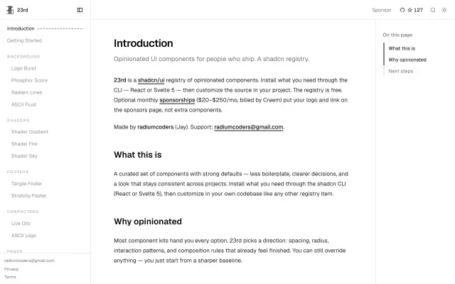
23rd preview

23rd

Opinionated shadcn registry of copy-paste UI components for React and Svelte 5.

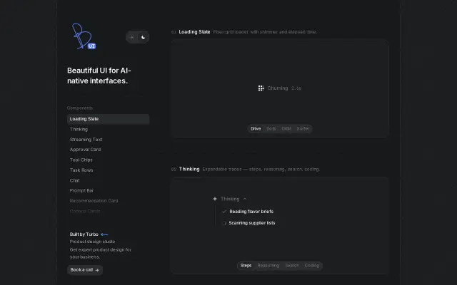
Beautiful UI preview

Beautiful UI

Copy-paste React components for AI chat agents, thinking states and human-in-the-loop flows.

Thinking Orbs preview

Thinking Orbs

Animated component set for showing an AI thinking state in a product.

Sonner preview

Sonner

Opinionated toast component for React, sensible defaults out of the box.

More in Frameworks & Libraries

See all 95
Boring Avatars preview

Boring Avatars

Open source React library for generating unique SVG avatars from names.

Zdog preview

Zdog

Round, flat, designer-friendly pseudo-3D engine for canvas and SVG.

Balsa UI preview

Balsa UI

Theme your own design system, then install its Vue or React components as source code that your coding agents can read and extend.

Create UI preview

Create UI

React component library of 65+ production components with a matching Figma file.